
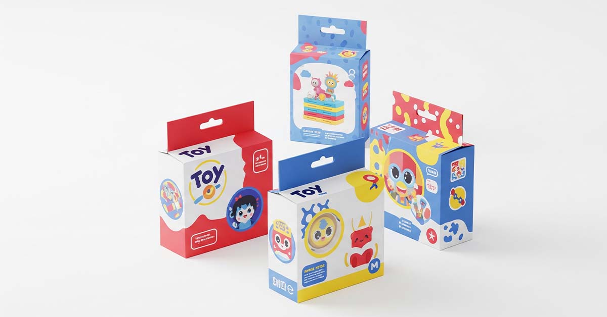
Toy packaging does far more than just hold a product. It sparks curiosity, fuels imagination, and drives the decision to buy—often in mere seconds. At the heart of this impact is colour. Colour plays a powerful psychological role, influencing emotions, perceptions, and purchasing behavior, especially in children. The psychology of colour in toy packaging is a nuanced subject that combines design, marketing, child psychology, and cultural trends. Let’s dive into how and why colours matter so much when it comes to packaging toys.
Why Colour Matters in Packaging
Children, particularly in their formative years, are highly responsive to visual cues. Before they can even read or fully understand a product, they’re already forming opinions based on what they see. Among all visual elements, colour is the first thing that catches their attention.
In a cluttered toy aisle or e-commerce page, products have to stand out within seconds. Bright, bold, or contrasting colours instantly capture the eye and help a toy stand apart from competitors. Colour can also communicate what the toy is meant for—whether it’s exciting, calming, creative, or educational.
Colour and Emotional Response
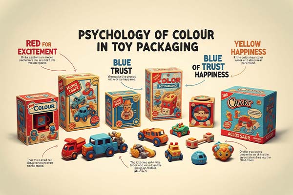
Each colour tends to evoke specific emotions or associations:
- Red: Often used to convey excitement, energy, and urgency. Toys meant for action or high engagement, like racing cars or blasters, frequently use red in their packaging.
- Yellow: Symbolizes happiness and optimism. It’s commonly used in packaging to appear cheerful and friendly, appealing to both kids and parents.
- Blue: Known for trust and calmness. Educational toys, tech gadgets, or toys that focus on building and logic often feature blue for its soothing and reliable feel.
- Green: Associated with nature, growth, and health. Eco-friendly or science-related toys may use green to reflect environmental consciousness or exploration themes.
- Pink: Traditionally associated with femininity, softness, and nurturing, often used in toys targeted at young girls, such as dolls or playsets.
- Purple: Evokes a sense of creativity, fantasy, and royalty. You’ll find purple in packaging for magical or imaginative toys.
- Black or Silver: Often used in toys meant for older kids or teens to give a more sophisticated, tech-forward, or “cool” look.
These colours don’t just help in emotional targeting; they also create brand recognition and consistency across product lines.
Age-Appropriate Colour Strategy
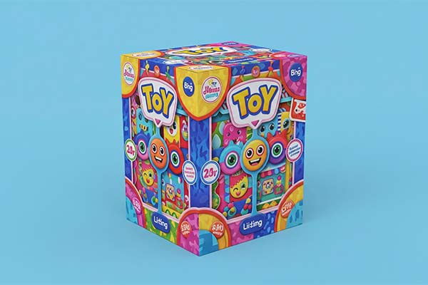
Different age groups respond to colour in distinct ways. For toddlers and preschoolers, bright primary colours like red, blue, and yellow are the most engaging. These shades are easier for them to see and differentiate, and they tend to associate these colours with fun and safety.
As children grow older, their preferences become more nuanced. They might gravitate towards cooler or more complex colour schemes, often influenced by their interests, gender identity, or even pop culture. Toy brands that succeed long-term tend to adapt their packaging strategies as their audience matures.
Gender and Colour Stereotypes
The use of pink for girls and blue for boys has long been a staple of toy marketing. However, modern consumers are increasingly critical of gendered colour coding. Parents are becoming more aware of how colour choices can reinforce stereotypes. Brands that move toward inclusive, gender-neutral packaging with diverse colour palettes are often praised for promoting equality and allowing children to explore interests without imposed boundaries.
While gender-targeted colours are still prevalent, more companies are now exploring broader palettes to widen appeal and foster creativity in both boys and girls.
Cultural Interpretations of Colour
Colour psychology also varies across cultures. For instance, while red may signify excitement and luck in many cultures, it can be associated with danger or warning in others. Similarly, white may symbolize purity in one region and mourning in another. For international toy brands, being aware of these differences is crucial to ensuring packaging resonates positively with diverse markets.
Colour and Brand Identity
Strong toy brands often develop a signature colour or colour scheme that becomes synonymous with their identity. Think of LEGO’s bold red packaging or Barbie’s iconic pink. These colours are not just visually appealing but serve to build recognition and trust over time.
When used consistently across product ranges, these colours become part of the brand experience—allowing children and parents to spot their favorite toys from across the aisle.
Colour in Digital Toy Shopping
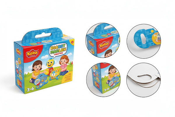
As more toy shopping moves online, packaging colour remains just as important—if not more. On digital shelves, you don’t have the benefit of 3D packaging or in-person demos. Colour becomes the quickest way to communicate emotion, category, or appeal through thumbnails and product photos. Toys that pop on-screen are more likely to be clicked, explored, and added to cart.
Trends Toward Sustainable and Minimal Packaging
Today’s consumers are also more eco-conscious. Some brands are embracing earth-toned colours, recycled materials, or minimalist designs to signal sustainability. Muted greens, browns, and natural hues may not scream excitement but can effectively appeal to environmentally aware parents.
Conclusion
The psychology of colour in toy packaging is a strategic tool that combines visual appeal with emotional and cultural resonance. From the moment a child sees a box on a shelf—or a parent scrolls past a product online—colour is silently working behind the scenes to create connection, spark joy, and influence the decision to buy.
As the toy industry evolves, so does the role of colour in marketing—moving beyond basic stereotypes to embrace inclusivity, sustainability, and emotional intelligence. Understanding the power of colour can help brands design more meaningful, appealing, and thoughtful packaging that